---
title: How We Design Custom Caps in Cyprus
description: Discover how The Patch Lab designs custom caps in Cyprus through identity, patch selection, colour, placement, scale and detail
image: https://www.thepatchlab.com.cy/hubfs/The%20Patch%20Lab%20C%20yprus%20-%20How%20we%20design%20custom%20caps%20and%20hats.webp
---
[Skip to content](https://www.thepatchlab.com.cy/blog/how-we-design-custom-caps-cyprus#main-content)
[Homepage](https://www.thepatchlab.com.cy)
- [Custom Headwear](https://www.thepatchlab.com.cy/custom-headwear-cyprus)
- [Early Access](https://www.thepatchlab.com.cy/early-access)
- [Our Story](https://www.thepatchlab.com.cy/about-the-patch-lab)
- [The Journal](https://www.thepatchlab.com.cy/blog)
[Join Early Access](https://www.thepatchlab.com.cy/early-access)
- [Custom Headwear](https://www.thepatchlab.com.cy/custom-headwear-cyprus)
- [Early Access](https://www.thepatchlab.com.cy/early-access)
- [Our Story](https://www.thepatchlab.com.cy/about-the-patch-lab)
- [The Journal](https://www.thepatchlab.com.cy/blog)
[Join Early Access](https://www.thepatchlab.com.cy/early-access)
[mailto:neofytosyng@gmail.com](mailto:neofytosyng@gmail.com)
Identity-Built Headwear The Patch Lab Cyprus Custom Caps Cyprus
# How We Design Custom Caps in Cyprus
.jpg?width=48&height=48&name=The%20Patch%20Lab%20(icon).jpg)
Written by The Patch Lab Cyprus Editors
August 17, 2026
A good-looking patch does not automatically make a good cap.
The colour might be right. The embroidery might look great. The symbol might immediately catch your attention.
But that is only the beginning.
At The Patch Lab Cyprus, we believe the strongest custom caps are not created by simply choosing several patches you like and placing them wherever there is space.
They are built through direction, balance and meaning. **Every detail needs a reason.**
## It Starts With Identity, Not Decoration
Before we think about patch placement, we start with a simple question:
**How do you want to be seen?**
Some people are drawn to darker, controlled streetwear.
Others connect with colour, nostalgia, music, gaming and energy.
Others prefer something cleaner, quieter and more refined.
This first decision creates the direction for everything that follows.
The cap colour, patch style, materials, placement and amount of detail should all speak the same visual language.
That is what separates an identity-built cap from a randomly decorated one.
## Not Every Patch Belongs Everywhere
A patch can look great on its own and still be wrong for a particular build.
A colourful arcade-inspired symbol may work perfectly within a nostalgic Retro Pop story but feel completely out of place beside industrial tactical graphics.
A metallic crest can create a strong refined identity, but adding several playful graphics around it can immediately weaken that feeling.
At The Patch Lab, we deliberately reject combinations when the details do not belong together.
**Good design is also knowing what not to use.**
## The Front Carries the Main Signal
The front of a cap naturally receives the most attention.
That means the main patch needs to earn that position.
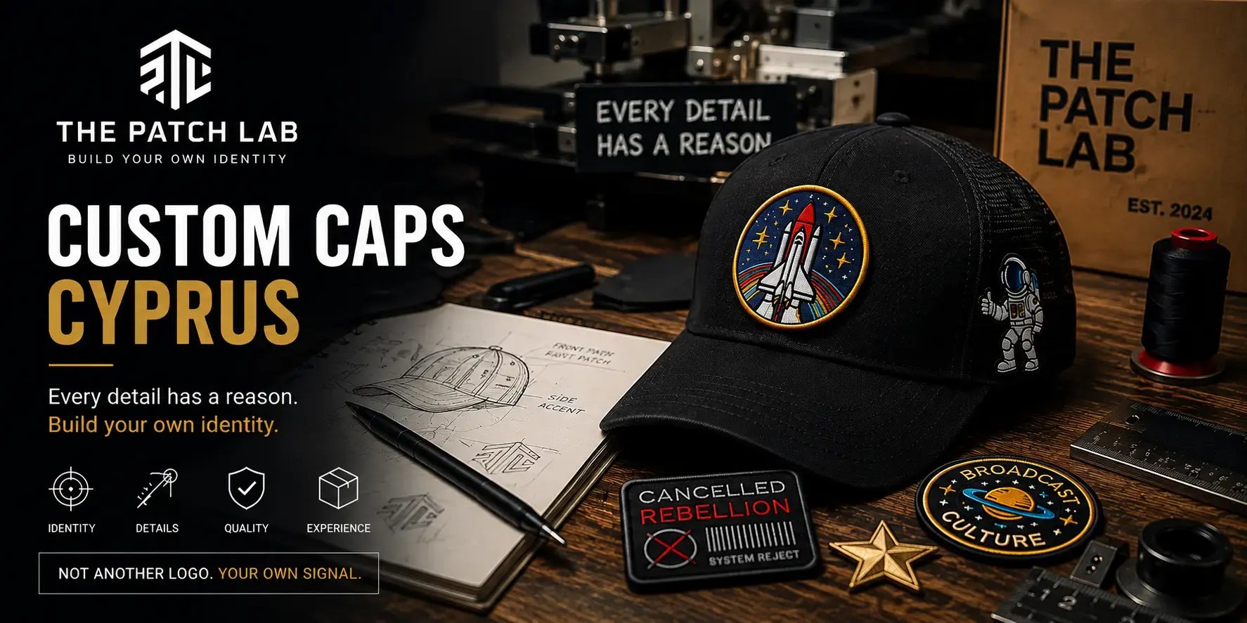
We treat it as the **anchor** of the design.
Its size, shape, colour and visual strength establish the direction of the entire cap.
But bigger does not automatically mean better.
A patch that is too large can overpower the cap, interfere with its structure or make the finished piece feel unbalanced.
The goal is not maximum decoration.
The goal is the right visual weight.
## Supporting Details Should Support
Once the main signal is established, smaller details can help develop the story.
The important word is **support**.
Side patches should not fight for attention with the front. They should add context, energy or another layer of meaning.
Imagine a build inspired by space.
The main symbol might establish the idea, while smaller supporting elements continue that same story.
The result feels connected.
Now imagine replacing one of those details with an unrelated luxury crest simply because it looks attractive.
Every individual patch might still look good, but the story disappears.
That is why we do not mix directions randomly.
## Scale Changes Everything
Before a patch becomes part of a cap, we look at scale.
A patch photographed by itself can appear completely different once it is placed against the proportions and curves of a real cap.
Too large, and it dominates.
Too small, and the visual message disappears.
Too rigid, and it may not follow the curve correctly.
That is why scale is tested before attachment.
The patch needs to work **with the cap**, not simply fit somewhere on it.
## Finish Matters Up Close
We also look beyond the graphic itself.
Thread density, edges, texture, colour saturation and overall finish can completely change the perceived quality of a build.
Different directions also need different finishes.
A darker industrial design may benefit from matte embroidery and controlled colours.
A nostalgic, expressive build can carry stronger colour and more playful texture.
A refined piece needs cleaner embroidery, restrained detailing and premium-looking finishes.
The material should reinforce the identity.
It should never contradict it.
## The Backing Is Part of the Test
The part nobody sees still matters.
Before attachment, the backing of a patch needs to be checked because the finished product has to do more than photograph well.
It needs to sit correctly on the cap.
Edges should remain controlled.
The patch should follow the surface properly.
The application should not create unnecessary wrinkles, lifting or distortion.
What happens behind the patch affects what you eventually see from the front.
## Three Directions. Three Different Signals.
The Patch Lab currently builds around three distinct identity directions.
**Urban Tactical** is for those who move differently - controlled, industrial, street-focused and structured.
**Retro Pop** is for those who bring colour and energy - expressive, nostalgic and influenced by broadcast culture, gaming, music and memories.
**Signature Lab** is for those who want something personal and refined - cleaner, quieter and built around meaningful symbols and premium details.
They are different for a reason.
The goal is not to give every cap everything.
The goal is to find the direction that feels like you and build consistently around it.
## From Patch to Identity
This is why we do not see patches simply as decoration.
A patch is one element.
The cap is another.
Colour is another.
Placement is another.
Texture is another.
Individually, they are just design choices.
When they work together, they create something more meaningful.
**A signal.**
Something that can communicate an attitude, interest, memory or part of your personality without needing to explain it.
That is the thinking behind the custom caps we are building in Cyprus.
Not random patches.
Not another brand logo.
Something designed to feel like yours.
**Build Your Own Identity.
Wear What Makes You Different.**
## Share this post
[mailto:https%3A%2F%2Fwww.thepatchlab.com.cy%2Fblog%2Fhow-we-design-custom-caps-cyprus](mailto:https%3A%2F%2Fwww.thepatchlab.com.cy%2Fblog%2Fhow-we-design-custom-caps-cyprus)
## Keep reading
### [ Identity-Built Headwear The Patch Lab Cyprus Custom Headwear Cyprus How to Choose Custom Caps in Cyprus](https://www.thepatchlab.com.cy/blog/how-to-choose-custom-caps-in-cyprus)
### [ Story-Built Headwear Cyprus Streetwear Identity-Built Headwear Why The Patch Lab Cyprus Is Building Identity-Built Headwear](https://www.thepatchlab.com.cy/blog/why-the-patch-lab-cyprus-is-building-identity-built-headwear)
[](https://www.thepatchlab.com.cy/)
SECURE PAYMENTS | CYPRUS BASED | QUALITY CHECKED | EARLY ACCESS
Build Your Own Identity. Not Another Logo. Your Own Signal.
© 2026 The Patch Lab. All rights reserved.

##### The Patch Lab® Cyprus - Identity-built headwear created around symbols, colour, story and personal meaning.
[mailto:neofytosyng@gmail.com](mailto:neofytosyng@gmail.com)
```json
{
"@context" : "https://schema.org",
"@type" : "BlogPosting",
"author" : {
"@type" : "Person",
"name" : "Written by The Patch Lab Cyprus Editors",
"url" : "https://www.thepatchlab.com.cy/blog/author/the-patch-lab-cyprus-studio"
},
"dateModified" : "2026-08-18T07:21:01.123Z",
"datePublished" : "2026-08-17T12:46:42.000Z",
"headline" : "How We Design Custom Caps in Cyprus",
"image" : [ "https://www.thepatchlab.com.cy/hubfs/The%20Patch%20Lab%20C%20yprus%20-%20How%20we%20design%20custom%20caps%20and%20hats.webp" ],
"mainEntityOfPage" : {
"@id" : "https://www.thepatchlab.com.cy/blog/how-we-design-custom-caps-cyprus",
"@type" : "WebPage"
},
"publisher" : {
"@type" : "Organization",
"logo" : {
"@type" : "ImageObject",
"url" : "https://www.thepatchlab.com.cy/hubfs/official%20The%20Patch%20Lab%20logo.png"
}
}
}
```